Card
Content container with multiple layout variants.
Code
components/Card.astro
---import { Image } from "astro:assets"; interface Props { variant?: "vertical" | "horizontal" | "bordered" | "shadowed"; imageSrc?: Parameters<typeof Image>[0]["src"]; imageAlt?: string; imageWidth?: number; imageHeight?: number; class?: string;} const { variant = "vertical", imageSrc, imageAlt = "", imageWidth, imageHeight, class: className = "",} = Astro.props; const baseClasses = "bg-white-ghost rounded overflow-hidden max-w-md"; const variantClasses = { vertical: "flex flex-col", horizontal: "flex flex-col md:flex-row", bordered: "border-2 border-black-onyx/20", shadowed: "shadow-lg shadow-black-onyx/10",};--- <div class={`${baseClasses} ${variantClasses[variant]} ${className}`}> { (variant === "vertical" || variant === "horizontal") && imageSrc && ( <div class:list={["bg-black-onyx/10", variant === "horizontal" && "md:w-48 md:shrink-0"]}> <Image src={imageSrc} alt={imageAlt} width={imageWidth} height={imageHeight} class="w-full h-full object-cover" loading="lazy" /> </div> ) } <div class="p-4"> <slot /> </div></div>
Preview
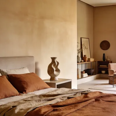
Vertical / Default
Desktop
Clean and minimal desktop setup for focused work.
Horizontal
Horizontal Card
Image on the left, content on the right. Stacks vertically on mobile.
Bordered
Bordered Card
Minimalist card with a thick border and no image.
Shadowed
Shadowed Card
Minimalist card with subtle shadow and no border.
Usage
Vertical/ Default Card
<Card variant="vertical" imageSrc={Desktop} imageAlt="Desktop" imageWidth={800} imageHeight={400}> <h3>Card Title</h3> <p>Card description here.</p></Card>
Horizontal Card
<Card variant="horizontal" imageSrc={Desktop} imageAlt="Desktop" imageWidth={400} imageHeight={400}> <div> <h3>Horizontal Card</h3> <p>Image on the left, content on the right.</p> </div></Card>
Bordered Card
<Card variant="bordered"> <h3>Bordered Card</h3> <p>Minimalist card with thick border.</p></Card>
Shadowed Card
<Card variant="shadowed"> <h3>Shadowed Card</h3> <p>Minimalist card with subtle shadow.</p></Card>
Props
| Prop | Type | Default | Description |
|---|---|---|---|
| variant | "vertical" | "horizontal" | "bordered" | "shadowed" | "vertical" | Card layout variant. |
| imageSrc | ImageMetadata | string | — | Image source for vertical/horizontal variants. |
| imageAlt | string | "" | Alt text for the image. |
| imageWidth | number | — | Image width in pixels. |
| imageHeight | number | — | Image height in pixels. |
| class | string | — | Additional CSS classes. |